Skip to Main Content or Page Contents

Brackets Editor Tutorial
Brackets Editor Tutorial
Brackets Editor Top Themes
How to choose a top theme in the Brackets Editor
Page Contents for Top Themes
How to Select an Installed Theme
Top Bold Themes
- Very strong contrasts
Fun light color brackets theme
Top Easy on the Eyes Themes
- Medium to strong contrastsTop Light Themes
Lower rank themes
Top Theme Introduction
What makes a top theme
A good color scheme will vary from person to person depending on various factors:
- The vibrance & color accuracy of their color screen
- Their eyesight
- How long they are looking at their screen
- Does the theme make What they wish to find on the screen stand out. This may be:
- A tag
- The text content
- An attribute
- Etc.
Theme colors
A good color scheme will vary from person to person depending on what they wish to find easily on the screen. This may be in an HTML document:
- An The HTML Tags
- The actual pages content
- Class / ID
- Comments
Choose colors that stand out for the items you wish to find easily
Theme Contrast / Readability
Readability is made easier by a very good contrast between the text and the background. On some monitor screens the highest contrast white & black, which I personally I prefer with my monitor, may be hard on the eyes. If this is the case you may prefer the themes I have marked as medium or good contrast.
In the graphic samples of the themes shown below I have enlarged the font size by 2 sizes from the default size. This makes it easier to read the poor contrast such as dark grey on black background
Fun Live Color Theme
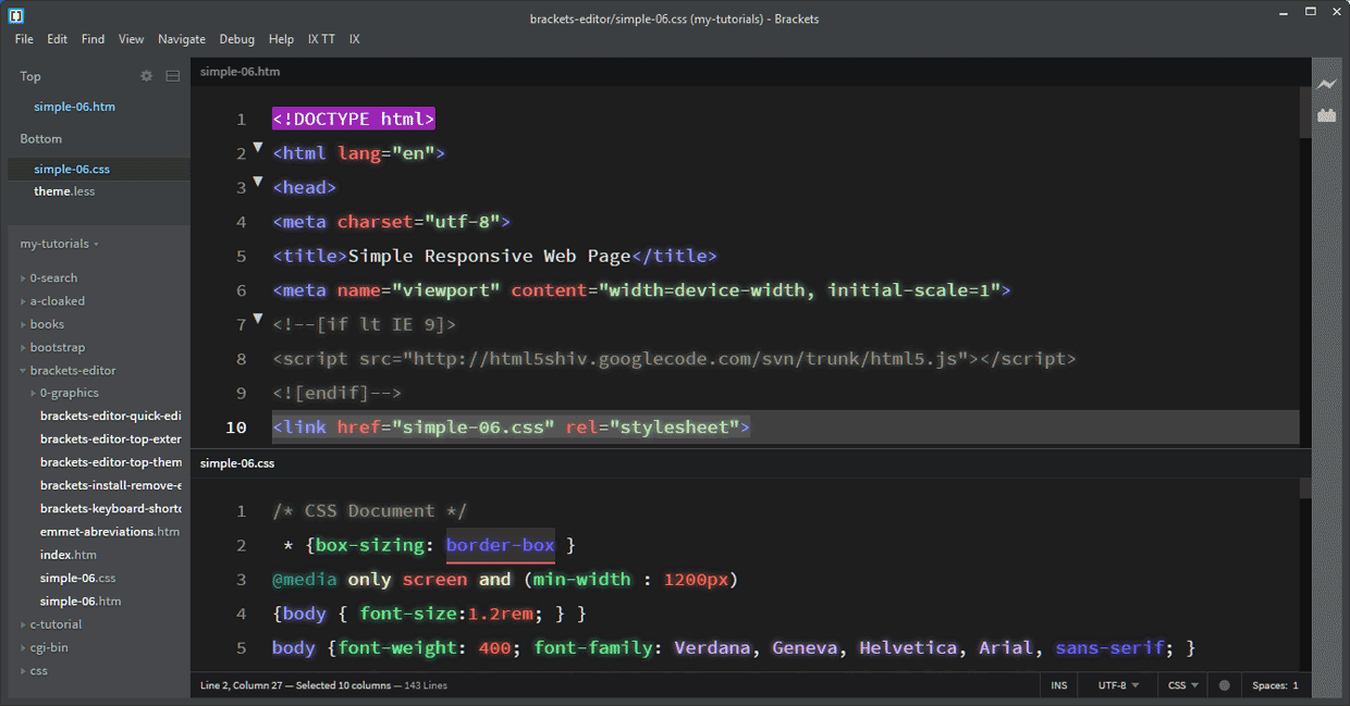
- Updated 3 Oct 2018 and renamed from fun-light-color-brackets-theme. Vastly improved to my Overall Top Number 1 Position
- 32 colors
- Overall Contrast: Excellent
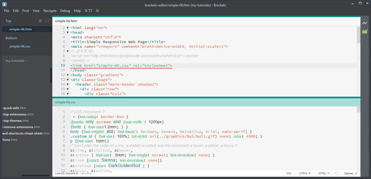
- Active Line Contrast : Medium Dark Grey on Black & by a white Line Number. See CSS line 10 above
- Selected Text : Bright Orange underline. See CSS line 2 above
| Color Palette |
|---|
| HTML Tag |
| Javascript Variable |
| Var 1 |
| Var 2 |
| Var 3 |
| Css Class |
| Foreground |
| Comment |
| Comment Active |
| String Color |
| Background |
Dark Revolution Theme
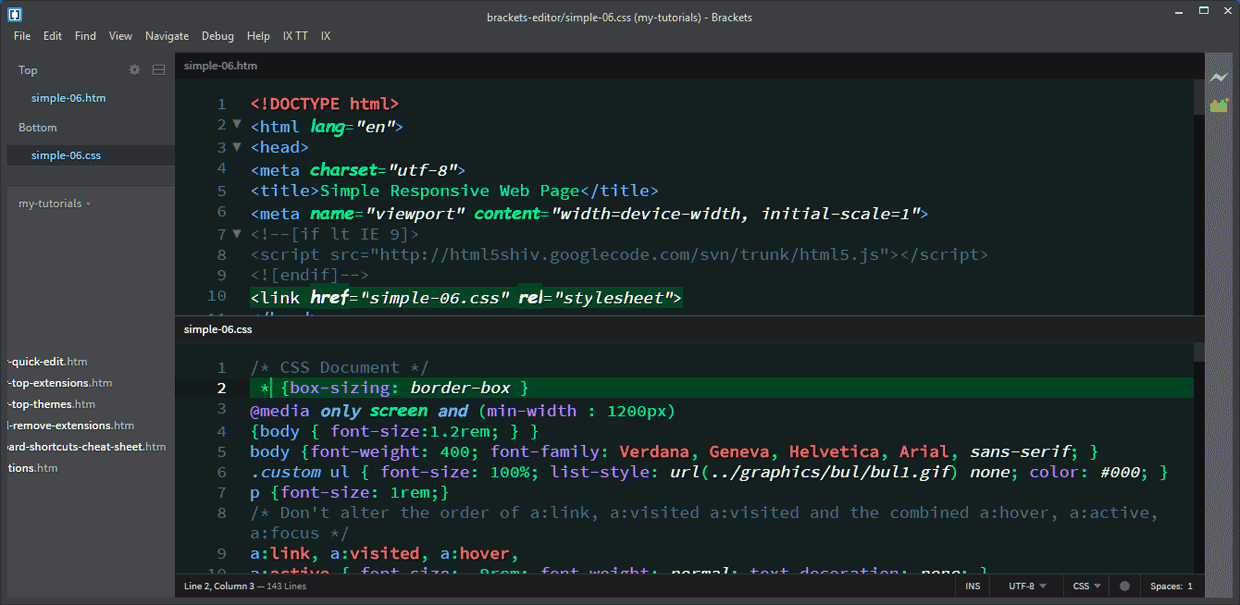
- 24 colors
- Overall Contrast: Very good. Very Bold
- Active Line 10 HTML: White Text. White Line Number
- Active Line 2 CSS : Poor to Medium Contrast. Dark Green Background against Black Background
- Selected Text Contrast: Poor Dark Green Background against Black Background
- Comments: Poor Contrast
Monokai Theme

Pros very good contrast including highlighted line 10 which is underlined with a white line
Cons color contrast for comments could be better
Sweet Dark Theme

Cons
Poor contrast on
- Comments
- line numbering except Current Line: which is very good
- Selected editing area poor contrast
Quick Light Theme
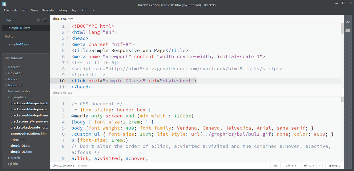
- Medium to Good Contrast
- Easy on the eyes
- Similar to the default Brackets Light Theme slightly different shades / colors
- Current Line: Good visibility
Paperback Theme (Light)
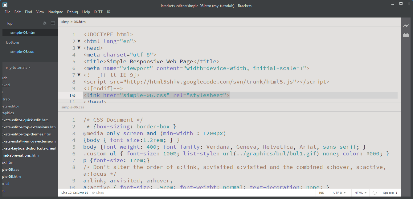
- Medium Contrast
- Easy on the eyes Medium Contrast
- Limited Colors ?
- Similar to the default Brackets Light Theme slightly different shades / colors
Monokai Corrail UR Theme
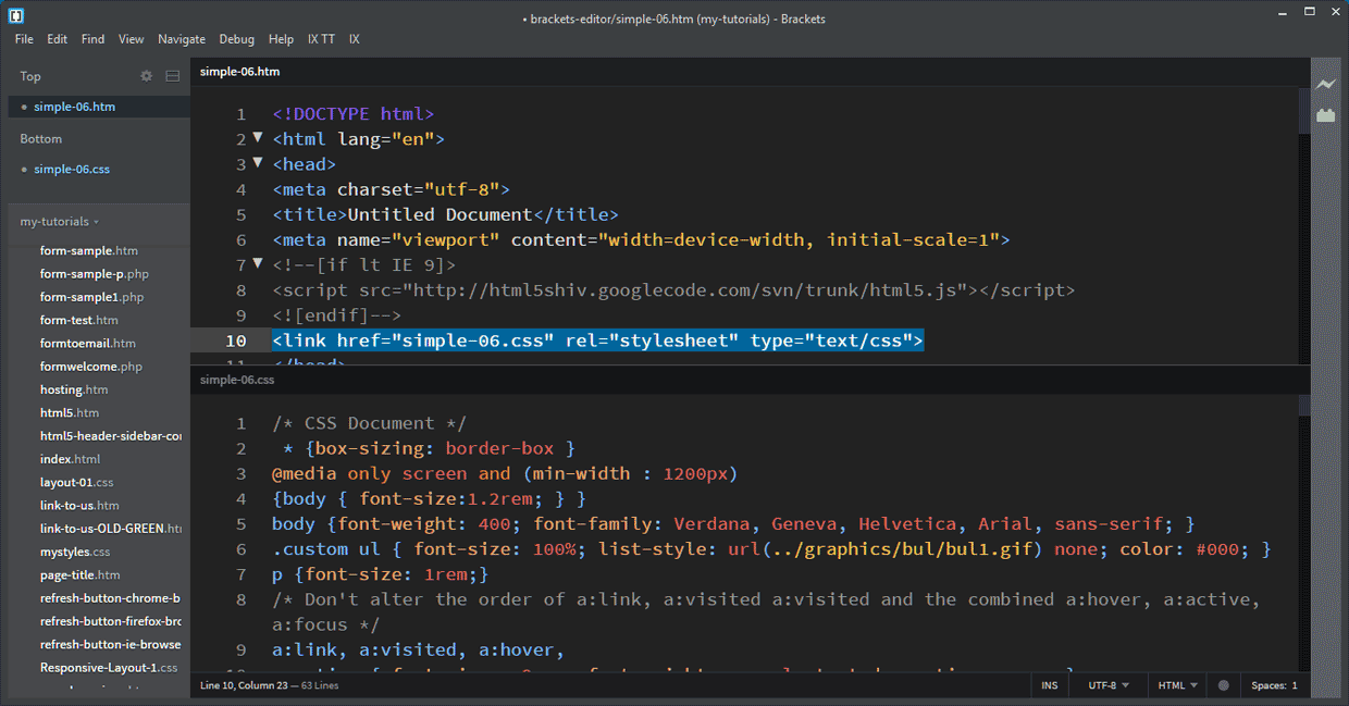
Almost identical to above Monokai Corrail Theme
Difference CSS attributes in this UR version are a lighter blue which is clearer on the black background.
Neon Theme
Cons color contrast for comments & numbers. dark grey on black.
Raven theme
 Pros good contrast
Selected Text Contrast: Fairly good contrast
Current Line: 10. White text on darkish blue background Stands out well but looses the theme colors
Dark Soda theme
Visual Studio Dark theme
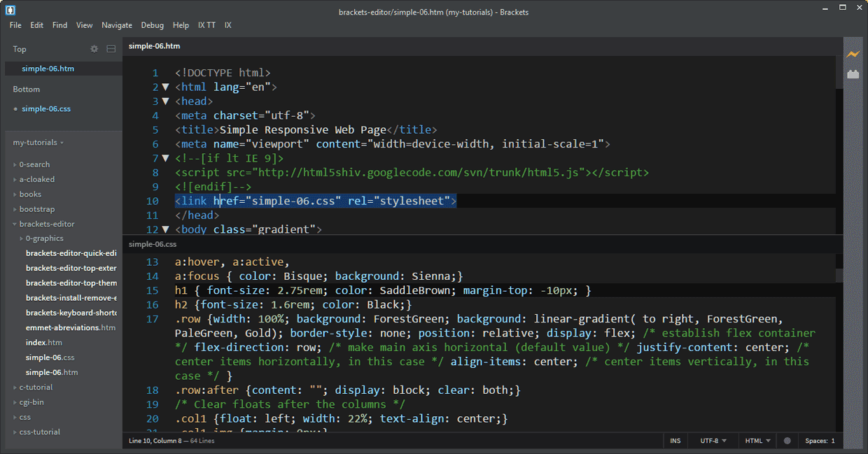
- Medium contrast - Easy on the eyes
- Current Line: & Selected Code: Dark blue background, visible but not very prominent
NewMoon Theme
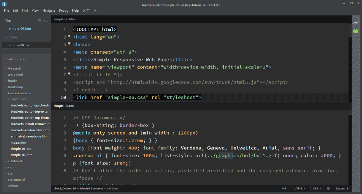
- 19 colors
- Over hall Contrast: Very good
- Active Line: indicated by a white Line Number
- Selected Text Contrast: Poor Dark Gray Background against Black Background
Delkos Dark Theme
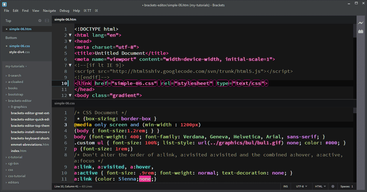
Good contrasts
Cons
A very unusual highlighted selected line 10 using several rounded corner borders that personally I don't like
Lower Rank Themes
Common Theme Faults
Fault 1 There is no or almost invisible indication of what code has been selected
Selected code is normally highlighted to make it easier to either delete the selection, move the selection or change the selection.
Examples:
In the following examples The Simple has been selected
Good example: Fun Live Color Theme 
Reasonable example: Raven Theme 
Very Poor example: New Moon Theme 
Fault 2 Current line i.e. the line you are working on. Poor Contrast / can be almost unreadable
The following Themes I have ruled out because of Very poor contrast of some colors
Hacker Theme V2
Very Poor Contrast: Tags, Comments, CSS properties
Eyeris Theme
Very Poor Contrast on Comments
Very Poor Contrast to indicate what code has been selected
CodePen
Line numbers invisible except Current Line:
Poor Contrast to indicate what code has been selected
Magpie Theme
Very Poor Contrast Tags & Selectors Dark Blue on Black
Very Poor Contrast to indicate what code has been selected
The following Themes I have ruled out because the current line I the line you are working on can be almost unreadable
Monokai Darker Soda
Material Color Light Theme
Black background on selected code makes Content text, comments, & punctuation almost invisible
Color box with border
Current line(s) underlined in red background line also changes to red when you click outside of the brackets window.
Space Theme
Pros good contrast
Cons Current Line: has white background. Normal white text & characters invisible with a white number & underline
888 Theme
No Line Numbers Except Current Line width a white number & underline
Medium Contrast
Selected Text Dark Blue Background
Theme
The following Themes I have ruled out because there is no or almost invisible indication of what code has been selected
Khrystalz UI Theme Possibly acceptable
Infinite Theme
Monokai Corrail Theme
Panda Theme
Space Theme
How to Install Bracket Themes
- Either:
- File > Extension manager… or
- Click the Extension manager icon
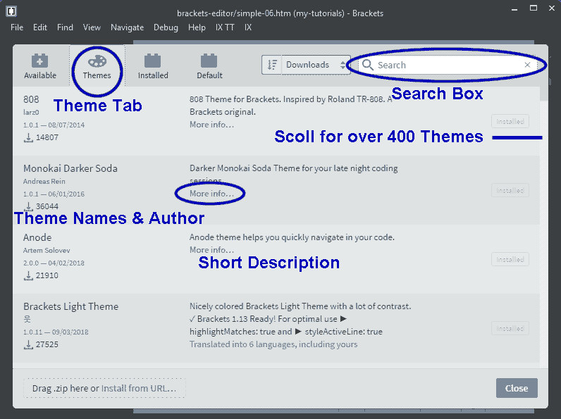
- Click the "Themes" tab
- Either:
- Type (the name or part of the name of the theme you want) in the top right search bar or
- Scroll down the list of Themes
- If required Click More info... for additional description
- Click "Install". Click
- Wait until the popup states "Installation successful!" then close on the pop up
- Repeat 3 to 6 to install more themes.
- Click Close on the extension manager
How to Select an Installed Theme
- Click View > Themes…
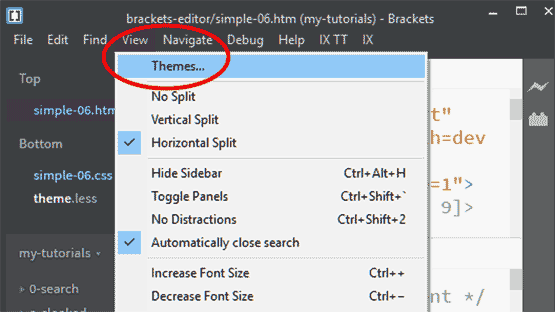
- In the Themes Settings Popup
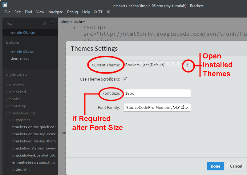
- Current Theme Shows the Current Theme
- Click the drop down icon on the right of the Current Theme to Open the Installed Themes List
- Select the theme you wish to use
- If required you can alter the font size
- Click Done
C Programming Page Contents
C Programming Menu
C Tutorial 4. Branch & Loop Introduction
C Tutorial 5. Branch & Loop Code
Programs
Video Editor
Filmora 10 Video Editor
Hosting & Domains
Hostgator
This site is hosted on Hostgator
123 Reg
Bluehost
Anti Virus Software
Kaspersky
Norton
AVG
Web Site Templates
DVD Tutorials
Books
CSS: The Missing Manual
CSS Pocket Reference
Html5 and Css3 All-In-One for Dummies
Web Design
Build Your First Website In Simple Steps
Responsive Web Design with HTML5 and CSS3
